BFX competition is taking place this summer and As a group we wanted to have a go at entering. We did a pitch video and we all created a showreel to show off all our work. This will be a great opportunity to improve our skills and also create a film together.
Here is our pitch video:
http://www.youtube.com/watch?v=9aHI3NXQGW4
During this week I had to create a show-reel of my texturing abilities. Not all my texturing work is on here, but this is great for applying for jobs. I can also add to it once my films are complete :). This is the showreel I sent to BFX.
Chelseas Showreel
Thanks for reading :).
I will update my progress of my other texturing works soon. x
Sunday, 28 April 2013
Thursday, 18 April 2013
Texturing More Characters
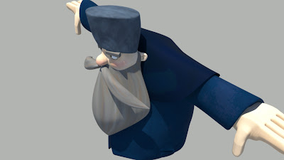
I am texturing the old man character in the short film Once upon a time in Leningard. He has two man characters in this film and I am texturing them both. I UV mapped the character first and then ed sent me an image of what colours he was thinking for the old man. here is one of Ed Hudsons drawings :).
Ed Hudsons drawing of the Old Man.
Looking at this Ed wanted the character to have mostly blue clothing and gray bread with black around his eyes. With this information I begun to start to colour the character in. Here are my Bump and my photoshop files.
Just like the character in my last blog, Ed wanted a slight bump to add texture to the skin. Using simple colours I tried to achieve a cartoon style. Unlike the other character where the hair had definition, Ed wanted it to be a block rather than detail. This gave it a more cartoon style rather than the plastacine style we where trying to achieve in the last character. Here are a few renders of the character using sun and sky lighting in maya.
I have another of Ed hudsons character to texture and pics of that will be up soon. thank you for reading :). x
Wednesday, 17 April 2013
Texturing a Character
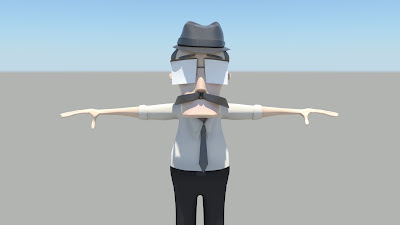
I was given the finished model for the main character in Dimension infinite, all UV mapped and ready to texture. Here is what the model looks like with out the Texture.
I got given a simple coloured drawing that showed what Ed Bulmber wanted the character to look like. This helped me know what I am working towards. This is the drawing Ed sent to me.
Thank you for reading :) x
I got given a simple coloured drawing that showed what Ed Bulmber wanted the character to look like. This helped me know what I am working towards. This is the drawing Ed sent to me.
Drawing done by Edward Bulmber.
Looking at this I then started to colour the guy in. Ed wanted to use bump maps so we could add detail to the man as well. Dine the body was one modeled piece we needed to show different materials, so to so this we added a bump to the different parts. Here are the Photoshop files of my bump map and the colour file.
The colour and the bump for the body. White raises the bump and black lowers the bump and gray is in between.
The face colour and bump.
The hat colour and bump.
Once I finished the colour I the applied the colour using Mia material X passes. This material allows us to use bump.
While exploring the Mia material I found out that you can apply more that one material on to the character. I wanted more detail on the skin so I started to play with granite bump. This made the skin have more of a texture to it. We also had a play around with a skin shader. This made the skin slightly too orange but we liked the texture so since Mia material allows you to place shaders on to it we placed both on to it.
Here are a few renders using sun and sky lighting.
as you can see in the renders, I added a very strong bump on the band around the hat, the ears and the hair. This gave the model a cartoon/plasticine look. So far i am happy with it.
I will also be doing Ed Hudsons characters as well. keep an eye out for them.
Thank you for reading :) x
Sunday, 7 April 2013
Creating a the Multi-Universe map.
In the film The Dimension Infinite Ed requested that I design the Map. This Map is quite important to the story. It has hidden clues and fills up one shot in the film. I went in too detail about how this map was going to look. I had the idea that it looked like an old sea map or a pirates map.
I gathered picture of old maps from the internet. I thought it would be great to have that hand drawn look as if it had been passed on and bits added to it. Ed requested that I add the infinite logo in the center.
I used Latin for the words all over the map as I thought that the main characters shouldn't be able to read or understand it. This gives the map so mystery.
Once I finished the design I took it in to Maya and started to create a Bump Map for it. Bump maps add a 'fake' texture to objects. It gives the illusion that there is more detail when there isn't. Here are a few test renders of the map.
Thanks for reading :)
I gathered picture of old maps from the internet. I thought it would be great to have that hand drawn look as if it had been passed on and bits added to it. Ed requested that I add the infinite logo in the center.
I then started to think about what else would be on the map. If this is a map to the multi universe we need different planets. I had a look at the different planets and what would be interesting to place on the map.
I then started to design the map. I tried to make it worn and crinkly. Here what it ended up looking like.
I used Latin for the words all over the map as I thought that the main characters shouldn't be able to read or understand it. This gives the map so mystery.
Once I finished the design I took it in to Maya and started to create a Bump Map for it. Bump maps add a 'fake' texture to objects. It gives the illusion that there is more detail when there isn't. Here are a few test renders of the map.
Thanks for reading :)
UV mapping the scenes.
As a texture artists my other roles involve UV mapping. UV mapping is where we unravel the model so we can put a texture on to it. I UV mapped objects and characters. This will ensure that the texture goes on the model smooth. Here are a few screen shots of UV mapped scenes from both films.
This is a lengthy process and it has took me a while to UV map everything. When everything is UV mapped I can move on to Texturing Items.
Thanks for reading :)
This is a lengthy process and it has took me a while to UV map everything. When everything is UV mapped I can move on to Texturing Items.
Thanks for reading :)
Saturday, 6 April 2013
More Paintings Please.
Showing my test sky painting to both Directors they have asked me if I could do more. They asked me to do a verity that would suit the style to there films.
Night Sky For The Dimension infinite.
Day Sky For The Dimension infinite.
Night Sky For The Dimension infinite.
The original. Acrylic paints on canvas.
Taken the original painting in to Photoshop to enhance the colour.
The original. Acrylic paints on canvas.
Taken the original image and enhanced it.
Digital sky painting for The Dimension Infinite.
Ed Bulmber also asked me to do a digital painting for his desert scene.
The morning sky for Once upon a time in Leningard.
Ed Bulmber also asked me to do a digital painting for his desert scene.
The morning sky for Once upon a time in Leningard.
The original. Acrylic paints on canvas.
Thank you for reading :) x
Painting a Sky.
I had this idea for both Ed Bulmers and Ed Hudsons film about painting
textures for there film. I thought it would be different and create a
different style as most people paint there textures digitally with
Photoshop or Zbrush. I thought it maybe a good idea to paint the sky's
as it would add surrealism to the films. Here is what I started with. I
used acrylic paint on canvas.
I started painting the main colours of the sky. I wanted to make it choppy rather than smoothing the colours out.
I then started to paint on clouds.
I then started to add more detail to the clouds.
Subscribe to:
Comments (Atom)


